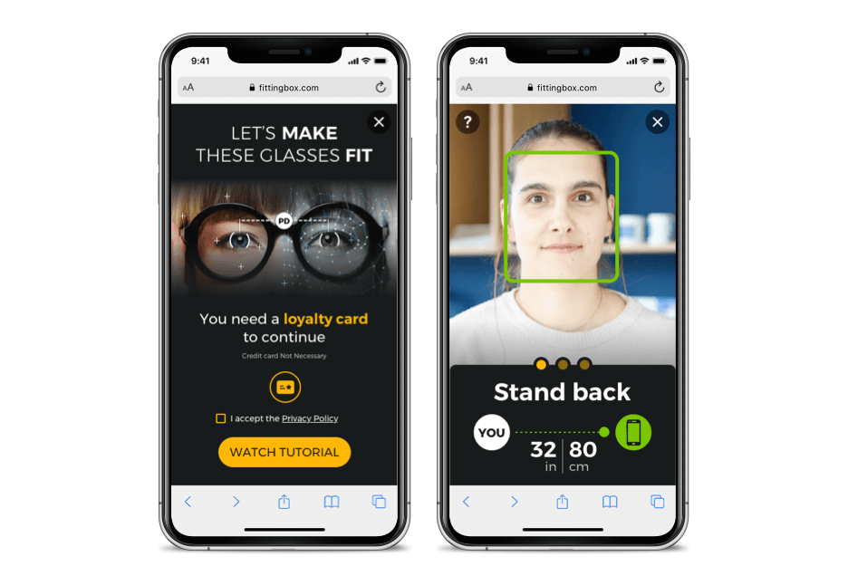
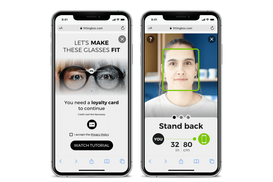
Theme Dark or Light
You can easily switch between Dark and Light modes using a dedicated parameter.
This quick customization allows the interface to visually blend with your website’s color scheme.


To implement, all you have to do is to add a darkTheme parameter
please refer to Integration Article to setup this parameter : How to integrate API PD Measurement?
Try the darkTheme with the CodePen at the end of this article.
Full Color Customization
Go beyond light and dark modes to fully align the PD Measurement interface with your brand’s visual identity.
You can customize the following color parameters:
-
Background (light or dark mode base)
-
Font colors
-
Button colors
To implement, read this full article and then please refer to Integration Article : How to integrate API PD Measurement?
Try color customization with the CodePen at the end of this article.
Examples
To go deeper in details and acces to higher customization, see next section "How it works"
1. Your primary website colors are yellow & black
Set the following parameters
| Parameter | value |
| darkMode | true |
| theme: { mainColor } | #FFB706 |
2. Your primary website colors are white & black
Set the following parameters
| Parameter | value |
| darkMode | false |
| theme: { mainColor } | #181B1C |
How it works
- Set the base mode (Dark or Light). This defines the overall visual foundation of your customization.
Note: Thethemeparameter is required for any custom color setup.
The background color is linked to the selected mode and cannot be customized. - Modify the following color parameters to fit your preferences:
(If a color is missing from your configuration, the default value for the selected mode will apply.)
| Parameter | Description | Default (Dark Mode) | Default (Light Mode) |
|---|---|---|---|
| mainColor | Primary color used for main text, buttons, and drawings. | #6CB4CC |
#6CB4CC |
| instructionColor | Text color for on-screen instructions above the video. | #FFFFFF |
#181B1C |
| buttonTextColor | Font color for buttons (CTA labels). | #181B1C |
#FFFFFF |
-
Validation colors :
These three parameters represent visual feedback indicators (green/orange/red) used to show progress or status during the measurement.
| Parameter | Meaning | Default (Dark Mode) | Default (Light Mode) |
|---|---|---|---|
| colorValid | Indicates “validated” state | #78C700 |
#78C700 |
| colorMid | Indicates “close but not validated” state | #FFA400 |
#FFA400 |
| colorWrong | Indicates “not validated” state | #FF0000 |
#FF0000 |
CodePen