Apply sufficient iframe dimensions
Adapt your layout to your modal display
Successful integration examples
Native Frame Carousel recommandations
Avoid overlapping elements
-
No interface element (carousel, logo, buttons, icons, etc.) should overlap the VTO iframe.
-
This includes both static and dynamic elements (banners, overlays, tooltips).
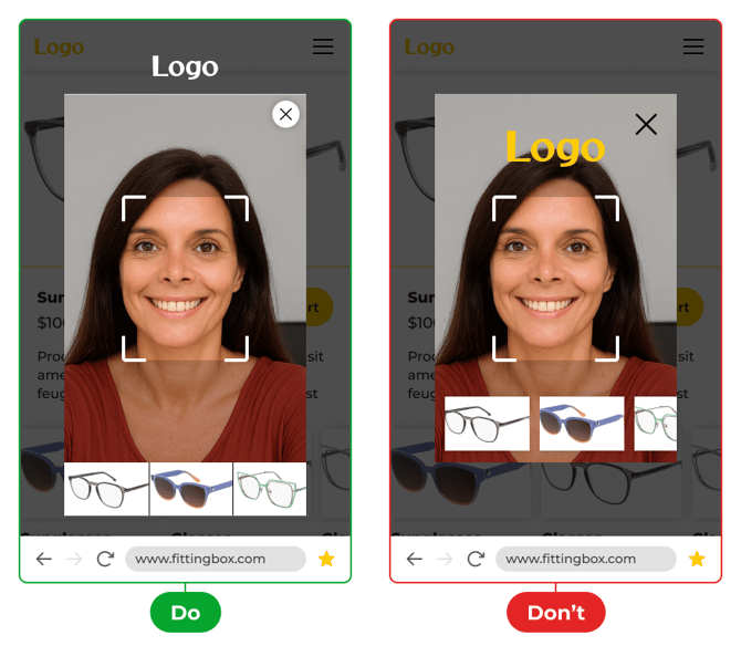
- Do not display custom elements while the disclaimer is displayed
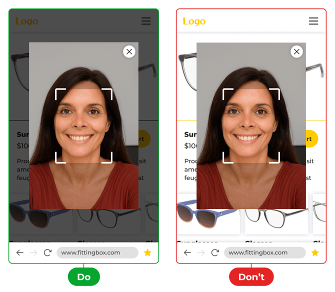
Apply sufficient iframe dimensions
-
For a good user experience, the iframe width must not be less than 60% of the total page width (min-width: 60%).
-
On mobile (< 768px screen width):
-
The minimum height must be 50% of the screen height (min-height: 50%).
-
-
On desktop (≥ 768px screen width):
-
The minimum height must be 400px (min-height: 400px).
-
Adapt your layout to your modal display
-
Adding a close icon is acceptable only if the VTO is displayed in a modal.
-
This icon must be placed in the top-right or top-left corner.
-
The maximum allowed size is 48px x 48px.
-
To ensure visibility in all contexts (light, dark, or video background), a contrasting background must be applied behind the icon (e.g., opaque circle or square).

General recommandations
-
Always test the VTO in different environments (desktop, mobile, tablet) to ensure readability and accessibility.
-
Make sure the VTO remains the main focus of the user experience, without distraction or visual overload.
-
When using a modal, background dimming is strongly recommended to limit distractions and improve readability.
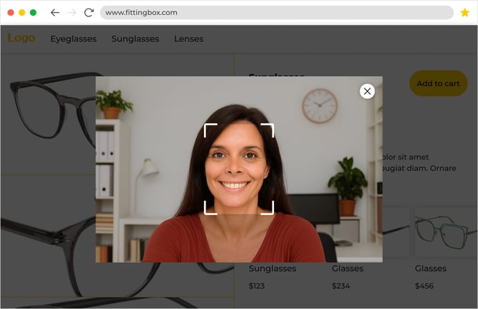
Successful integration examples
Desktop integration
Here is an example of a successful desktop integration :
-png.png?width=670&height=390&name=mobile%20(5)-png.png)