General principles
Native Frame Carousel is rendered inside the VTO interface and adapts automatically based on:
-
The number of recommended frame models provided
-
Frame variants provided (color, size, lens color)
-
Device type (desktop or mobile)
-
Virtual Try-on container size
Only items with all required fields are displayed. Invalid or incomplete entries are not rendered.
Layout depending on configuration
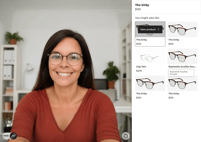
Recommended frames only
-
Displays a recommended frames section.
-
Maximum 6 frames.
-
No variant selectors displayed.
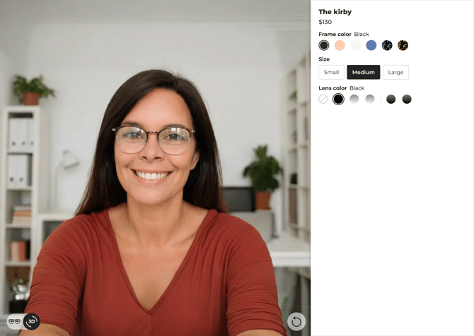
Variants only
-
No recommended section.
-
Displays selectors for each configured variant type:
-
Frame Color
-
Size
-
Lens color
-
-
Frame color selector only appears if at least two valid variants exists (active variant+another variant).
-
Other variant types appear only if at least one valid variant exists.
There is no limitation on the lens color and frame color variants displayed
Recommended frames and variants

-
Recommended frames section is displayed.
-
Variant selectors are displayed for the active frame.
-
Selecting a recommended frame updates the VTO and its associated variants.
Partial or invalid data
-
Variants with missing required fields are not displayed.
-
If all variants of a type are invalid, that selector is hidden.
-
Empty sections are never rendered.
Desktop layout
-
Native Frame Carousel is positioned on the right side of the screen, as a vertical panel
-
Variant selectors are stacked in separate sections.
-
The canvas zone is displayed on the left.
Mobile layout

-
Native Frame Carousel is positioned at the bottom of the screen.
-
Recommended frames are displayed in horizontal scroll.
-
Variant selectors are accessible through expandable menus.
- The canvas zone is displayed in the upper area.
Responsive behavior
Virtual Try-on automatically switches between desktop and mobile layouts based on screen size. No additional responsive implementation is required from the integrator.