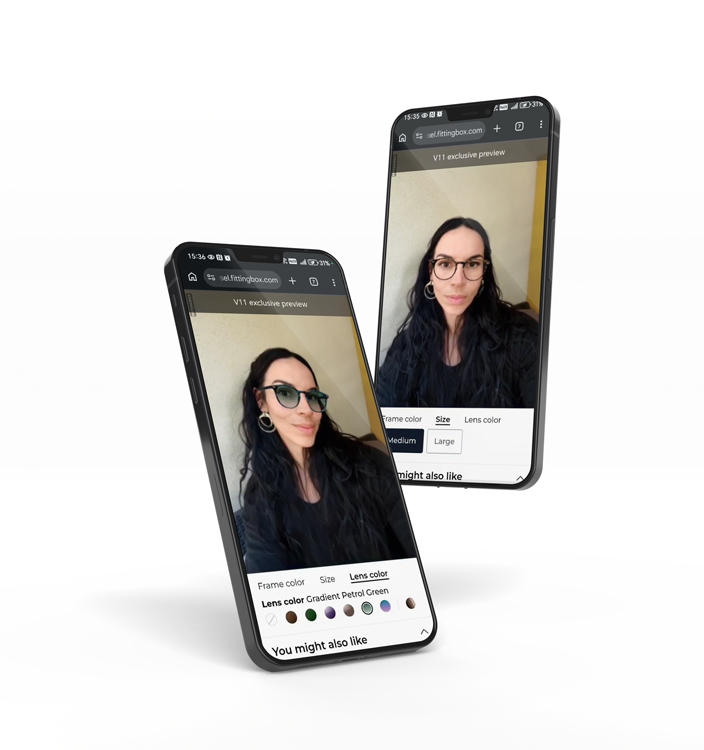
Start by reducing eyewear-specific hesitation. Improve product visuals, add virtual try-on, clarify sizing, simplify prescription steps, and make mobile checkout easier to complete.

Increasing Shopify conversions in eyewear is not only about faster pages or better discounts. Glasses shoppers need confidence before they buy, especially when fit, face shape, lens options, and prescription details influence the final decision.
For eyewear brands and optical retailers, conversion optimization must reduce uncertainty at every step of the journey. The stores that win in 2026 will make online frame selection feel clearer, more visual, and easier to complete.

Eyewear e-commerce is growing in a market where shoppers have more choice, more comparison points, and higher expectations for online product experiences. The global eyewear market was valued at USD 200.46 billion in 2024 and is projected to reach USD 335.90 billion by 2030, according to Grand View Research.
At the same time, global e-commerce sales are forecast to reach USD 6.88 trillion in 2026, with online transactions expected to represent 21.1% of total retail sales. For eyewear retailers on Shopify, this creates a clear opportunity, but also a conversion challenge.
Unlike simple accessories, glasses are personal, visible, and often prescription-based. A shopper may like a frame but still hesitate because they are unsure whether it suits their face, matches their style, or can be ordered with the right lenses.
That is why improving Shopify conversions in eyewear requires more than generic CRO tactics. You need to help shoppers answer one question faster: “Will these glasses work for me?”
Before changing your theme, adding pop-ups, or testing discounts, identify the friction that is unique to eyewear. Shoppers often abandon the journey because the decision feels too uncertain.
Common blockers include frame size confusion, lack of face-fit confidence, unclear lens options, missing prescription guidance, limited model images, and uncertainty around returns. These issues are especially important for first-time buyers who have never purchased prescription eyewear online.
A useful way to audit your Shopify store is to map every step from product discovery to checkout. Then ask what the shopper still needs to believe before moving forward.
| Customer friction | Conversion risk | Business response |
|---|---|---|
| “Will this frame suit my face?” | Product page exit | Add virtual try-on and clearer style guidance |
| “Is this the right size?” | Lower add-to-cart rate | Show frame dimensions and fit explanations |
| “Can I order my prescription easily?” | Checkout abandonment | Simplify prescription and PD steps |
This approach makes Shopify conversion rate optimization more focused. You are not only improving a store. You are removing the doubts that stop eyewear shoppers from buying.
Virtual try-on is one of the strongest conversion tools for eyewear because it addresses a core problem: shoppers want to see how frames look on their own face before committing.
For a Shopify eyewear store, glasses virtual try-on can help reduce purchase hesitation by making the experience more personal, visual, and interactive. Instead of asking shoppers to imagine the result, you let them try frames virtually from the product page.
This matters because eyewear is highly visual. A frame can look appealing in a packshot and still feel wrong once the shopper imagines it on their face. Virtual fitting helps bridge that gap by supporting the emotional and practical part of the decision.
For Shopify teams, the business value is clear. Try-on interactions can increase product engagement, session quality, and add-to-cart confidence.
If your store is built on Shopify, a dedicated virtual try-on app for eyewear e-commerce can make implementation more accessible. The goal is not to add a feature for novelty. The goal is to create a stronger buying experience that helps users decide faster.
Your product page is where Shopify conversions are often won or lost. For eyewear, it must do more than present a product. It must answer questions about style, fit, quality, comfort, lenses, and purchase conditions.
Start with visual assets. Use consistent frame images, lifestyle photos when relevant, and close-ups that show material, bridge shape, temple design, hinges, and color details. If shoppers cannot inspect the product clearly, they are more likely to delay the purchase.
Then improve the information hierarchy. Put essential details near the buying decision, including frame width, lens width, bridge size, temple length, material, shape, color, and compatible lens options.
For premium or technical collections, a 3D Viewer for eyewear product pages can support product confidence by allowing shoppers to examine frame details from different angles. This is especially useful when the design includes subtle color gradients, transparent materials, or distinctive temples.
Use social proof with precision. Reviews should help answer fit and comfort questions, not only praise the brand. For example, highlight comments about lightweight frames, narrow fit, wide fit, comfort for daily wear, or style accuracy.
The best product pages reduce cognitive effort. They make the next step feel safe, informed, and natural.
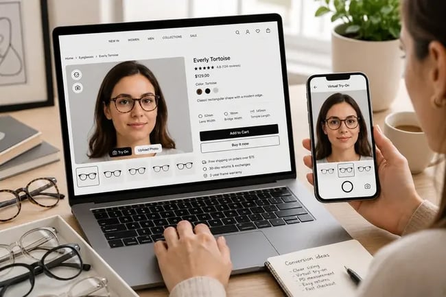
Prescription steps can create friction late in the funnel. A shopper may choose a frame, add it to cart, and then stop because they are unsure how to provide their prescription or pupillary distance.
This is a major issue for Shopify conversions because late-stage hesitation is expensive. The customer has already shown purchase intent, but the process becomes too technical or unclear.
To reduce this risk, explain prescription options in plain language. Let shoppers know whether they can upload a prescription, enter values manually, send it later, or request support. Avoid forcing technical decisions before the customer understands what is required.
For pupillary distance, an online PD measurement tool can support a smoother eyewear buying journey by helping users complete an important measurement step without leaving the online experience.
Good UX also means knowing when to reassure. Add short explanations near prescription fields, use examples, and make support visible. If your store sells progressive lenses, tinted lenses, or lens upgrades, present choices in a way that helps users compare benefits without feeling overwhelmed.
The simpler the optical journey feels, the more likely shoppers are to complete checkout.
Mobile performance is central to Shopify conversion optimization. Shopify reported that the average mobile e-commerce conversion rate for online retail was 2.89% as of June 2024. For eyewear stores, mobile UX is even more important because shoppers may discover frames through social media, ads, email, or search before comparing options on the go.
Mobile friction often appears in small details: slow image loading, hard-to-tap buttons, long product descriptions, hidden size details, poor filter usability, or complex checkout forms.
Baymard Institute reports a global average cart abandonment rate of 70.19%. That does not mean every abandonment can be prevented, but it shows why checkout friction deserves serious attention.
For eyewear Shopify stores, focus on the following improvements:
Mobile UX should help shoppers stay confident, not force them to zoom, search, or guess.
Personalization can improve Shopify conversions when it helps shoppers find relevant frames faster. It can hurt performance when it adds too many steps or feels like a distraction.
For eyewear, personalization should guide the shopper toward better choices. Useful inputs include face shape, preferred style, frame size, color preference, lens needs, use case, and budget. The result should be a shorter, clearer product selection.
A simple quiz can help first-time buyers filter a large catalog. A “similar frames” section can keep shoppers engaged when one model is out of stock. A recommendation block can suggest frames based on shape, material, or collection.
Personalization also supports merchandising. For example, a Shopify eyewear store can recommend lightweight frames for daily wear, bold acetate frames for fashion-focused buyers, or blue light lenses for screen-heavy workdays.
However, keep the journey simple. The best personalization does not feel like extra work. It feels like useful guidance.
For broader UX improvements, online eyewear user experience solutions can help retailers create a more reassuring and conversion-oriented buying journey.
Trust is a conversion lever, especially in eyewear. Shoppers need to know what happens if the frame does not fit, if their prescription is incorrect, or if they need help after purchase.
Strong trust signals should appear before checkout. Include clear return policies, warranty information, prescription support, delivery expectations, secure payment badges, and customer service access.
Do not hide important reassurance in footer links. If a shopper is evaluating a frame, they should quickly see whether returns are easy, whether lens support is available, and whether the brand can help with prescription questions.
Trust also comes from consistency. Your product photos, size guides, try-on experience, reviews, and checkout messaging should all tell the same story. If the product page feels premium but the checkout feels confusing, confidence drops.
For B2B eyewear teams, this is where conversion optimization connects directly to brand equity. A clear journey does not only increase sales. It makes the retailer feel more reliable, more professional, and easier to buy from.

Shopify conversions should not be measured only by final purchase rate. In eyewear, the buying journey includes several micro-conversions that show whether confidence is increasing.
Track product page engagement, try-on launches, try-on completion, add-to-cart rate, prescription step starts, PD measurement starts, checkout completion, return rate, and assisted revenue from users who interacted with visual tools.
This gives your team a clearer view of what is working. For example, if virtual try-on users add to cart more often, you can promote try-on more visibly. If many shoppers start the prescription step but do not finish, you may need clearer guidance or a simpler form.
Use A/B testing where possible, but avoid testing too many variables at once. Start with changes that match real shopper friction: product page clarity, try-on visibility, mobile CTA placement, prescription explanation, and checkout reassurance.
The most effective Shopify CRO strategy is not a one-time redesign. It is a continuous process of identifying hesitation, improving confidence, and measuring the impact on revenue.
Increasing Shopify conversions for an eyewear store in 2026 means helping shoppers feel confident before they buy. Better visuals, virtual try-on, clear product pages, easier prescription steps, mobile-first UX, and smarter measurement all support the same goal: turning online hesitation into informed purchase decisions.
Start by reducing eyewear-specific hesitation. Improve product visuals, add virtual try-on, clarify sizing, simplify prescription steps, and make mobile checkout easier to complete.
Yes, virtual try-on can support conversions by helping shoppers visualize frames on their own face. This reduces uncertainty and can make the buying decision feel more confident.
PD measurement is important because it helps customers complete a prescription eyewear order accurately. A smoother PD step can reduce friction during the online buying journey.
Track product page engagement, virtual try-on usage, add-to-cart rate, prescription step completion, PD measurement starts, checkout completion, return rate, and assisted revenue.
Request a demo, a quote or set up an appointment with one of our sales representatives.
CONTACT US
© FITTINGBOX 2026 • Terms of use • Privacy & Legal